It is a cliché that data is the gold of the 21st century, and few trends enjoy as much hope and hype in architecture than digitalization, big data, machine learning, and data-driven design in general. Information-communication technologies pave the way for instantaneous and coherent feedback on design choices, a better understanding of the intricacies between nature, humans, and the built environment, the production of new knowledge, and prediction of the complex, far-reaching impacts of decisions. This would allow more conscious resource management, wider participation, and quicker reactions to rapid shocks, crucial for both sustainability and resilience. However, these promises cannot be taken for granted, and a new profession is required to bridge the gap between data technologies and designing the built environment. This short article introduces 5, lesser-known principles that can make or break the success of data-driven design, some food for thought for architects and urban designers pivoting towards digitalisation.
1: Data is not a tool, models are
A major telecommunications provider asked us to look for ways to exploit their secondary data assets. In a dense urban environment, based on cell data alone, the company could tell the position of each carrier with a 20-30 meter accuracy. How could this be turned into value? By that time dozens of GIS-based services already existed, which visualize the flow of people in cities alongside physical and statistical data overlays. These usually quantify location value – a critical indicator for real estate development – based on visitor density. However, this long-hanging fruit of data utilization follows a data-based mindset, rather than a model-based one. Instead of starting from the data we have, we started by creating a model for location value. The basis of this model was an ecological analogy: we imagined places to be organisms in an ecosystem, and the flow of people to be a resource cycle to compete for. This analogy shifted the attention to places in the context of other places, and we used the data to classify ecological relationships between places: mutualistic (e.g., between an ice-cream parlour and a park), parasitic (a fast-food chain next to a traditional restaurant), commensalistic (a tobacco store near a bus stop), or competitive (between two supermarkets). Following this model, we recommended our client not to monetize positional data, but data structures describing time spent, time of day, and the trajectories of people.
Data is rarely a value in and of itself, a model is required to link data to a phenomenon, which is valuable to understand.
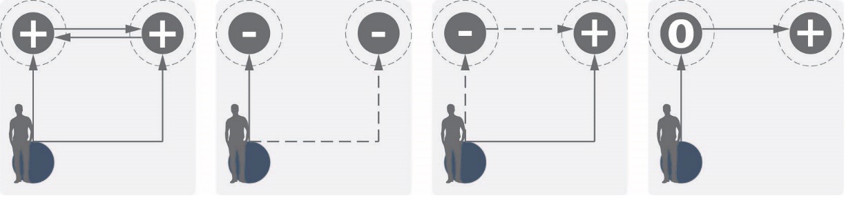
Ecological interactions derived from routing data: mutualism, competition, parasitism, and commensalism
2: There is more than one model of reality
The same phenomenon can be understood through multiple models – space syntax is a good illustration for this. Space syntax is a concept-turned-scientific field developed in the 80s, which asserts that social logic of space can be understood mathematically. There is a plethora of space syntax analyses following the same logic: (1) the abstraction of urban space to a network model, (2) running topological analyses on the network, (3) empirical studies to see if the metric correlates with a behavioural or social phenomenon. It was proven for instance, that network analytic techniques can predict accessibility, however, four different metrics can be used to so with similar accuracy. So, which one describes urban space better? The answer is: all of them, but each with a different perspective.
It is beneficial to think of a model as a specialist, who can analyse something in great detail, but through a very narrow perspective. The data-designer therefore must be a generalist, who can interpret and synthesise results.
For example, in a case study in Vienna, we were tasked with examining the perceived safety of public spaces, for which we developed an index of multiple space syntax metrics. Who were our „specialists”? We analysed the sizes of the field of vision, the amount of spaces perceivably hidden (known unknown spaces) and the complexity of visible boundaries from any given point. These are important and not often quantified determinants of perceived safety, but it is still not a comprehensive picture. The presence of other people, the environmental quality, lighting also pay a role, and were not part of the model. For the case study, these were design variables, and we used the space syntax metrics to inform urban designers where to put programs to increase presence, and where to design lighting to counteract visually more sensitive areas.
3: Data presentation is a unique form of communication
In many cases reporting results, as a last step is often overlooked, even though each step of data processing, filtering, clarification, rationalization is also a form of manipulation of the story, which influences the decisionmaker. In the analysis of the streetscape below, the same data is displayed, one raw, the other with a logarithmic projection, which we later used for reporting. Why use a manipulated dataset? As it is apparent on the left figure, the values were disproportionately high for large open spaces. The target area for analysis however, was the centre block in the figure, where the differences between values became less apparent (because the colouring always follows a linear projection). The logarithmic projection resulted in more pronounced differences in this centre area (and more uniform data visualization at the edge). Manipulations like this will often be necessary, because the data carry multiple stories, each relevant for different design questions, and it is our responsibility to direct attention to the one that is relevant. At the same time, it is our ethical responsibility to ensure fidelity between message and the data, transparency over uncertainties and the context, while at the same time, we must provide the reader what they are looking for, without the masking for it.
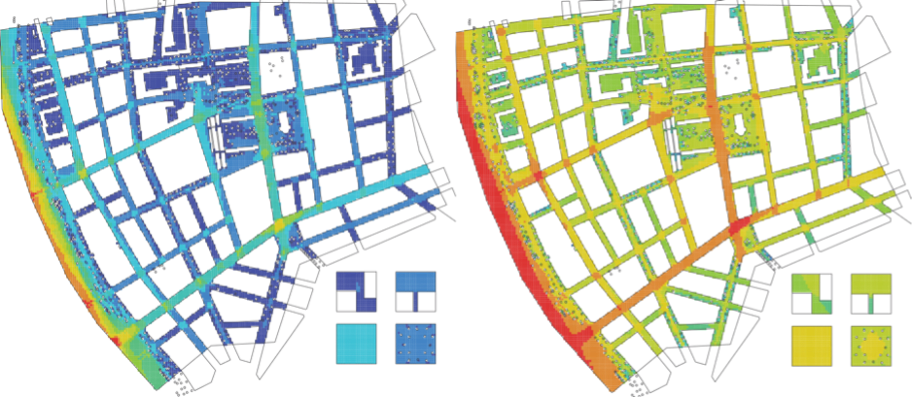
Results of the same analysis undistorted (left side) and logarithmically distorted (right side). As a result of the distortion, the right side figure better displays the differences within the design area. Source: ABUD
4: Comparing pears and apples
Most design problems will have multiple, interacting aspects to consider. Energy efficiency, for instance, can directly influence operational expenditures, comfort, air quality, physical activity, which can translate to non-energy, monetizable benefits on the macro level, such as increased productivity, or lower health expenditures.
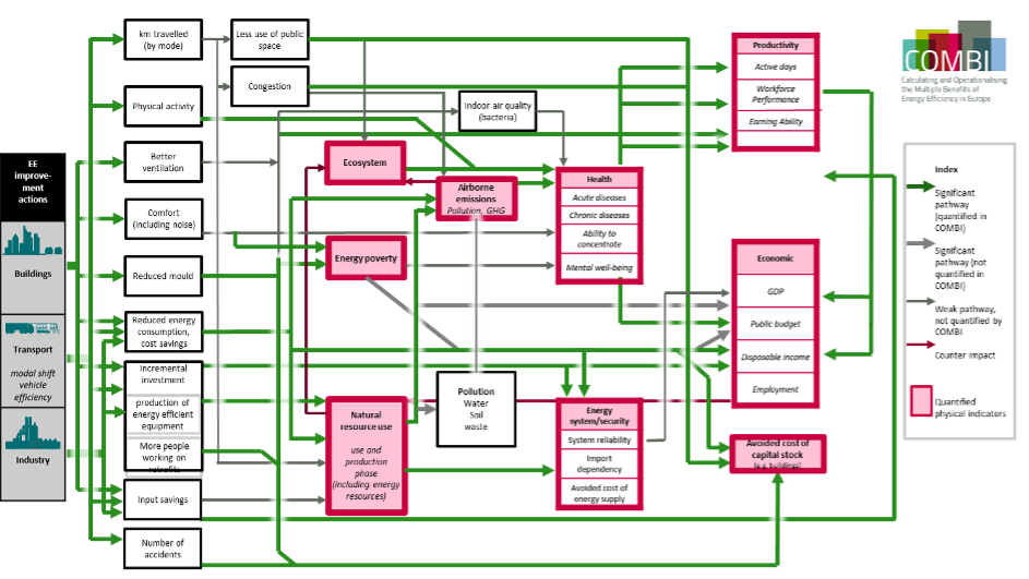
The multiple- and co-impacts of energy efficiency. Red nodes indicate quantifiable, monetizable impacts. Source: www.combi-project.eu
Now let us assume that, as an analyst, we define a list of performance indicators, including productivity and health expenditures. If, after a refurbishment of an office building, we record results in a decrease in sick leave days, and a decrease in sick leave renumerations, then the same impact was double counted.
The ad-hoc specification of indicators can skew decision-support, the selection of an indicator is already influencing the decision.
In a complex system like a city, we have to be able to compare pears and apples, we have to model interactions among hydrogeology, climate and weather, transportation, land use, behaviour, economy, etc. Only measuring indicators derived from strategic goals yield mere information crumbs, standing in the middle of complex causal networks. It is our responsibility to map out as holistic pictures as possible to identify what to measure in the first place.
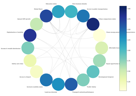
Causal network used by the SmartCEPS system, filtered to focus on mobility. Colder colours indicate a higher weight in the subgraph. Source: ABUD
5: Standardization versus specificity
The BMW Guggenheim Lab was investigating the public spaces of Bombay, focusing on how women use them, relying on surveys and interviews. The results showed that 87% of local women feel that public spaces are inaccessible for them, with most prominent reasons behind this being perceived safety, sexual harassment, the presence of men, and public opinion. Only for 4% of respondents, was distance the main cause of inaccessibility.
What does that mean? On the one hand, this shows how well qualitative, empirical, immersive studies can synergize with data-driven design support. Usually, it is unrealistic to measure everything, exhaustively, and field experiments are great tools to map out which data will be more important. On the other hand, the experiment shows how different a dataset might be relevant for the same goal in different cities. The latest urban development strategy of Budapest specified indicators for green spaces with metrics focusing on quantity, and closeness. This, however, would be relevant for only 4% of women in Bombay.
The latest urban development strategy of Budapest specified indicators for green spaces with metrics focusing on quantity, and closeness. This, however, would be relevant for only 4% of women in Bombay.
Relying on data-driven design alone does not solve conflicts like this, and it is not a good practice to
uncritically replicate standardized indicator frameworks, because a lot of important local, tacit knowledge is lost, and we can paint a fake picture of our city.
What I wished to share with these points, that a new emergent profession of data-driven architects and urban designers cannot stop at the adoption of data science skills but would necessitate skills to find and synthesise different knowledges. Resource management applications will require subject-matter knowledge, digitalized participatory design requires skills of interpretation, adaptation requires perceiving and processing different modelling paradigms, and integrating them. The gold rush is not necessarily for data, but for people who can write good dictionaries!
Author
Viktor Bukovszki – Senior Consultant, ABUD
References
Hillier, B.; Hanson, J. The Social Logic of Space; Cambridge University Press, 1984; ISBN 9780521233651
Thomas, S.; Ürge-Vorsatz, D.; Thema, J.; Thomas, S.; Suerkemper, F.; Mzavanadze, N.; Ürge-vorsatz, D. More than Energy Savings : Quantifying the Multiple Impacts of Energy Efficiency. Conference: ECEEE summer study, Volume: 2017, 1727–1736.
Kwai, S. Your Place, My Place, or Our Public Space?: Privacy and Space in Mumbai; Mumbai: BWM Guggenheim Lab, 2013
Noyman, A., Larson, K., Tinn, P., Winder, J. I., Chin, R. C. C. Boston rapid transit community engagement; 2016, retreived from: https://dam-prod.media.mit.edu/x/2019/08/28/Barr_Final_Report_vFinal2.pdf